A car marketplace for Dhaka where every car comes with its own inspection report, and 5% holds it for 7 days, refundable.

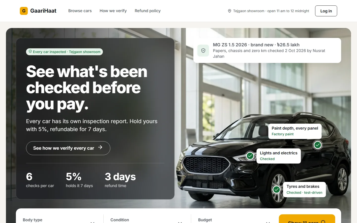
Home: the promise first, then the proof. Pins mark the parts that were checked.
Buying a car in Bangladesh usually means a listing, a phone number and a lot of trust. You hear "reconditioned, grade 4" and "no accident", and you find out whether it is true after you have paid.
I set myself one brief to practise the whole chain on: a site where someone can find a car, reserve it online with an advance, book a time to see it, and leave with a booking slip. Figma first, with a real token system, then a real website built from it.
Stress-testing the brief changed one answer that changed everything: who verifies the car? My first reading was the buyer. That turns the site into one more classified board. If the marketplace checks every car itself, the product is no longer the listing. It is the inspection report, with a name and a date on it.
So every screen had to answer what a buyer asks in the showroom, before they pay:
Papers, chassis and engine numbers, auction sheet, mileage, a physical inspection, and every part changed or repaired.
Refundable for any reason, back to the same card or account within 3 days.
Chassis and engine numbers appear only after you reserve, printed on the slip so you can match them on the car.
I wrote the brief, IA and tokens myself, built the system and key screens in Figma, then directed AI to build the site from them, and clicked through every flow in a real browser rather than trusting the code.
Colour variables with Light and Dark modes, type and spacing with Desktop and Mobile modes, every component bound to them. I changed one variable and watched the buttons and badges repaint before building a single page.
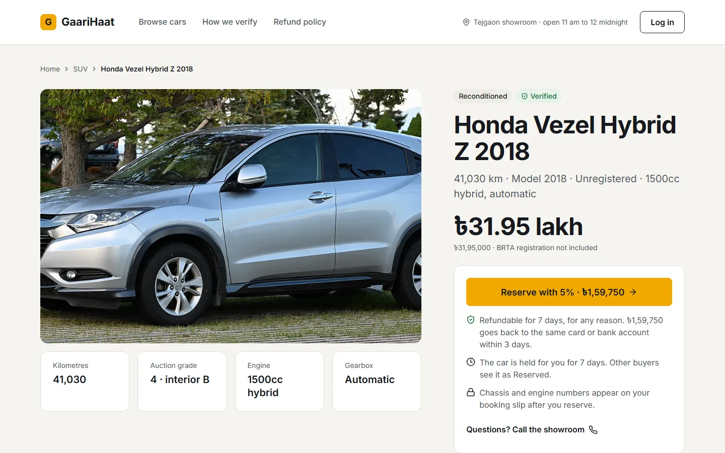
A single template reads each car's data. Reconditioned cars show the Japanese auction sheet, used cars show their BRTA papers instead, brand new cars show warranty. Reserved and sold cars stay on the list with the days left, and lose the Reserve button.
Wrong OTP, a declined card ("no money was taken, the car is not reserved yet"), bank transfer, changing the visit time, cancelling for a refund. The happy path is the easy part.
In the inspection report each tick lands one after another. On the confirmation the chassis and engine numbers arrive last, because they were hidden until that moment. Nothing runs past 300ms, and it all switches off for people who turn motion down.
Inter has no ৳ glyph, so prices fell back to whatever font the phone had. The site pulls that one character from Noto Sans Bengali, so ৳ looks the same on Windows, Android and iPhone.


Reviews on the home page. The IA had a reviews block. With no real buyers, every review would have been invented, on a site whose whole promise is that nothing is made up. I left it out.
bKash and Nagad, for now. Mobile money is not one more button: it means leaving the site, a PIN, an OTP, typing a transaction ID back in, and waiting for verification. Version one takes the 5% by card or bank transfer.
My own rule, once. I do not use glass effects. After comparing nine reference car-site heroes, I broke that rule for the hero panel only, because it let the photo carry the page. It is the one place on the site, and I wrote down why.
I ran a design review on the Figma screens as if they were someone else's: 0 pass, 4 needs work, 1 fail. The fail was accessibility. The "Verified" green was 4.44:1 on its tint (the standard is 4.5:1), form borders were 1.78:1 where 3:1 is needed, mobile captions were 12px, and buttons had no focus state. All fixed in the tokens, so every screen picked them up at once.
Then I clicked through the built site end to end, the way a buyer would, and found five bugs no review had: the cursor jumped to the start of the phone field after an error, error messages showed before anyone had made one, the refund countdown said 8 days instead of 7, a booking card ran off the screen on mobile, and one more, below. Making this case study found a sixth: on a 1440 laptop, the hero's stats slid under the search bar.
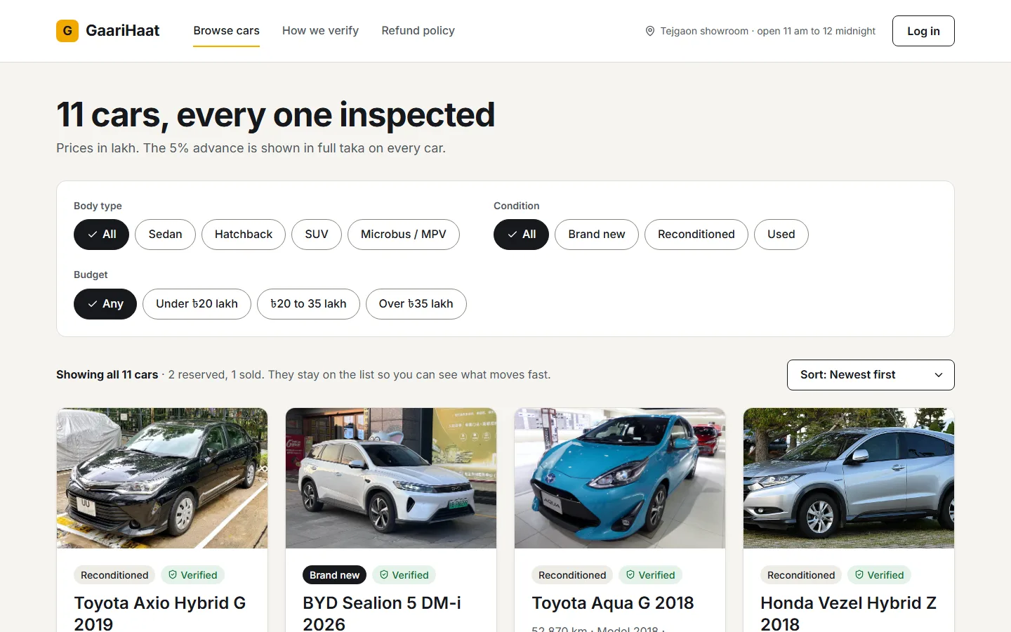
A working demo, from brief to a live site in two days: browse, eleven inspected cars, log in, reserve, pay, pick a visit time, booking slip, and a refund that puts the car back on the list. Cars, prices and payments are samples; no real money moves.
The Honda Vezel has one repair, a small dent in the front fender. The page said "2 notes", because the repaint shows up in the physical inspection and again under parts repaired, and I was counting rows, not problems. On a site built to be honest about each car, I had made a car look worse than it is. The review did not catch it; clicking through did. Now notes are counted per issue, not per row.